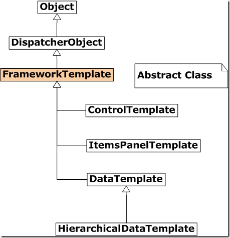
We have seen few examples of data template. Now let’s take a look at control template. Here is a class hierarchy of control template.
Now let’s take a look at the example of applying control template on progress bar. In this simple example we are define one simple control template to just display the current value of progress bar.
1: <Window.Resources>2: <ControlTemplate x:Key="ProgressTemplate">3: <TextBlock Foreground="DarkBlue" FontSize="24"4: HorizontalAlignment="Center" VerticalAlignment="Center"5: Text="{Binding ElementName=txtPercent, Path=Text}"/>6: </ControlTemplate>7: </Window.Resources>8:Here the name of the control template is “ProgressTemplate”. We can define this template to any progress bar we like by setting the template property. Template is a Control template type property define in Control class. In this piece of code we are not only defining of control template, but also data binding with another UIElement.
Now we are going to define two progress bar. One without any control template and one with control template. In this example we are going to study how we can apply the control template to selected controls not on every control. Here is a complete XAML file of this program.
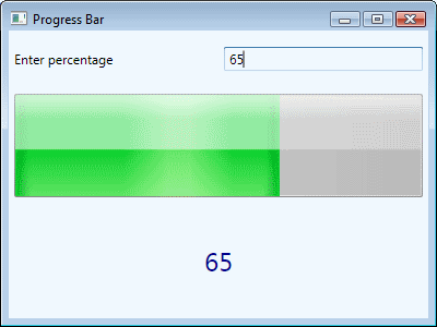
1: <Window x:Class="WpfProgressBar.Window1"2: xmlns="http://schemas.microsoft.com/winfx/2006/xaml/presentation"3: xmlns:x="http://schemas.microsoft.com/winfx/2006/xaml"4: Title="Progress Bar" Height="300" Width="400">5: <Window.Resources>6: <ControlTemplate x:Key="ProgressTemplate">7: <TextBlock Foreground="DarkBlue" FontSize="24"8: HorizontalAlignment="Center" VerticalAlignment="Center"9: Text="{Binding ElementName=txtPercent, Path=Text}"/>10: </ControlTemplate>11: </Window.Resources>12:13: <Grid Background="AliceBlue">14: <Grid.RowDefinitions>15: <RowDefinition/>16: <RowDefinition Height="2*"/>17: <RowDefinition Height="2*"/>18: </Grid.RowDefinitions>19:20: <Grid.ColumnDefinitions>21: <ColumnDefinition/>22: <ColumnDefinition/>23: </Grid.ColumnDefinitions>24:25: <TextBlock Grid.Row="0" Grid.Column="0" Margin="5" VerticalAlignment="Center">26: Enter percentage27: </TextBlock>28: <TextBox Grid.Row="0" Grid.Column="1" Margin="5" Name="txtPercent" VerticalAlignment="Center">29: </TextBox>30: <ProgressBar Margin="5" Grid.Row="1" Grid.Column="0" Grid.ColumnSpan="2"31: Minimum="0" Maximum="100" Value="{Binding ElementName=txtPercent, Path=Text}"/>32: <ProgressBar Margin="5" Grid.Row="2" Grid.Column="0" Grid.ColumnSpan="2"33: Minimum="0" MaxHeight="100" Value="{Binding ElementName=txtPercent, Path=Text}"34: Template="{StaticResource ProgressTemplate}">35: </ProgressBar>36: </Grid>37: </Window>38:Here is the output of this program.


[…] Template of Progress Bar Revisited We studied how make a control template of progress bar. In that sample we display ellipse and the current value of progress bar inside the […]
By: Control Template of Progress Bar Revisited « Zeeshan Amjad's WPF Blog on January 22, 2010
at 11:25 pm
[…] Relative Source We already specify the control template of progress bar. Now lets extend it little bit and display the the text in ellipse. Here is our first […]
By: Using Relative Source « Zeeshan Amjad's WPF Blog on January 22, 2010
at 11:27 pm